Friday, January 30, 2009

It's Just Right!

Another set of monogrammed cards! Gee, I wonder who had a snow day this week and extra creative time? I chose to use designer paper entitled Perfect Day by CTMH, for my perfect snow day project. The colors are g-o-r-g-e-o-u-s. I had no problem finding a matching floral stamp and copics to color-coordinate the envelopes.

This double-sided paper is so stinkin' pretty that I spent more time coordinating which sides to pair up than I did in actual card assembly! Yes, playing with paper is such a difficult task, she said with a sigh. There are three cards without mats (above) and three card with mats (below).

The monograms were stamped using the JustRite Damask Border, and the font is from the JustRite Special Occasions set. I want to share a tip on using Nestabilities to cut and mat a stamped image. Place the die so that your stamped image is centered and simply place a small piece of scotch tape on the edge of the die prior to cutting. Wa-la ... a perfectly centered cut every time. I learned this the hard way, nuff said.

Now, on to the scalloped tag which is actually a mini-card adhered to the front of the stationery box. I learned this technique from Sharon Johnson's blog. The base of the tag opens like a card. Fold your paper just like you do for a card, then position your Nestie onto the the paper making sure that the top portion of the Nestie is OFF the paper. You end up with BASE CARD that has a nice fold. I then stamped and cut a SEPARATE decorative tag using the same size Nestie, which then fit perfectly on top of the card base.

My separate tag top is stamped using the JustRite Harmony Classic Circle Stamper III set. This is a big mamma stamp (3 1/4") and somewhat difficult to get a clean stamp with no messed up edges. Thus, my sister & I held a teleconference meeting to discuss every possible solution. {We do this a lot, and sometimes she lets me call the meeting to order.} The result? Place a soft push pad under your paper before stamping. I also learned to eliminate the unwanted inked edges by running a kleenex around the wood base after inking. Meetings really can be productive! I was happy with my separate tag top! So ultimately the card base went from looking plain ....

... to this! I will write a personalized message inside the scallop note card to my friend. Something like, "Hello dear friend of mine. "
So this picture shows how the stationery box looks with the scalloped tag/card attached. Detailed instructions for the box can be found here. Once you make this box, you'll find a gazillion reasons to make it again! And now for the big finale ...
My BIG HAPPY CREATIVE MESS! Snow days are JustRite!

Wednesday, January 28, 2009

Scrap of Busy Paper

Interview with Me, Myself & I:

Q: Hi Me! What does a girl do when she has a perfectly good scrap of busy paper leftover?
A: Get busy!

Q: How do you balance "busy" with "lazy"?
A: Personally, I myself like to add the calming forces of black or brown.

Q: Well, then please tell me, me, why the black polka dotted ribbon rather than plain?
A: See Busy Handbook, Rule #214 which states as follows: "Busy must be balanced by another busy in order to preserve the busy."

Q: Is there ever an occasion to unbusy, busy?
A: Of course! It's called multi-layered Nestabilities.

Q: Me, can we talk for just a minute about 2-step stampin?
A. Sure, I've got all day and I love to talk! A lot. A really lot.

Q: So ... talk.
A: Geez, pushy aren't you, me?!

Q: *$%&(#$)@(*#
A: SU 2-step stampin is a great result .... eventually. Maybe it's my obsessive compulsive behavior, but I have to stamp it several times on scrap paper until I finally get it aligned to perfection. Personally, I myself believe that SU should offer 2-step stamps in clear acrylic but I am not on the SU board or anything like that. Alas, it does not keep me from ordering more 2-step stampin stash (i.e. 2SSS).

Q: Perhaps you should take 2-step stampin lessons and become a better 2-step stamper?
A: Do you always tick off your interviewee? Or am I just special?

Tuesday, January 27, 2009

Another Peak Inside My Creative Process

I was asked a question in my previous post regarding Magic Splash software. McKenzie asked me how to upload Magic Splash photo's to Blogger, since it was not allowing her to save the photo in a jpeg format. So off I went off to do a "test run" and here we go! Here is what I found.

When I opened Magic Splash software and imported my photo, I first made sure that the photo was originally in a jpeg format. Then I worked my Magic Splash Magic (so easy -- you will LOVE this software). Then instead of choosing to "save" my photo, the trick was to "save as" and then you have the option to keep the jpeg picture format. I always add a "1" or "2" to the named picture so as to preserve the original. Is this clear as mud?

I hope this helps McKenzie and anyone else out there who might have or consider buying the Magic Splash software. It really is a fun little tool, especially for people like me who find Photoshop to be a challenge for my brain at the end of a day. Now -- this post was supposed to help Miss McKenzie .... but wanna know sumpthin' tricksy? McKenzie needs NO help. Go see her fabulous photo shoot on her blog! This girl rocks!
Photo Credit in this post: I would be a bad Granny if I neglected to say that these precious photos feature my favorite 4-year old granddaughter, Princess Rhegan herself. The queen has spoken. She is the apple of my eye.

Saturday, January 24, 2009

Valentines - Bling it on!

Disclaimer: These cards are ridiculously fun! And busy. And did I mention fun? You know Picasso is at work when there is only one square inch of dining room table that does not have something covering it! It all started innocently enough ... my Unity Kit of the Month arrived and then I made a spontaneous combustion stop at Archivers with my mom. Let's dish, shall we?

Ridiculously Fun Card #1 front view. DP is from the Basic Gray/Urban Prairie collection. I could not resist this paper any more than I could ever resist a cream-filled twinkie! It is hip, fresh, and full of life. Get thee to Archivers and indulge yourself! The stamped flower and sentiment are both from Art Warehouse/My Heart Flowers {limited edition}, colored with copics - doesn't it match the DP to a tee! Ridiculously Fun Card #1 inside view. You've heard me say this a million times, and here is a million and one -- if you care enough to send the very best {and I bet you do}, then match the inside and envelope to your card! The recipient will think you went the extra mile for them ... and you did!

Ridiculously Fun Card #2 front view. The stamped heart explosion is from Unity KOM -- my mailbox does the happy dance when the monthly box arrives! Again, image is colored with copics and cut/embossed with Spellbinders Nestabilities. Okay, I HAVE to figure out a storage system for my Nesties ... I digress, but it's on the to-do list! Sentiment is from Stampendous Clear/Love Messages.

Ridiculously Fun Card #2 inside view. This shows you a great view of the heart explosion. If you are new to copic markers, don't forget to outline your copic-colored images with W1 {warm gray} for depth. SO much bang for your buck!

Ridiculously Fun Card #3 front view. Go ahead, ask me how I cut the black scallop mat around the stamped flower image ... notta, uh uh, no way, did not do ... it's part of the stamp! Unity KOM again! Now I admit, this one wins the busy prize but shouldn't Valentines Day be a little giddy? Besides ... I HAD to use the bling flower accents since they were my one free Hot Spot item from Archivers!
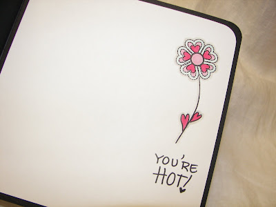
Ridiculously Fun Card #3 inside view. Speaking of hot ... wouldn't this be a fabo card to send to my 86 year old mom who makes cards and loves shopping at Archivers with me? She would trot off to the activity center at her Independent Senior Community and announce to the world she is hot! The apple doesn't fall far from the tree, kids. Have a beautiful day!


Tuesday, January 13, 2009

RAK from Lori

Whoo-la-la is right! Check out this yummy card that Lori sent me! I love it! She is such a sweet heart. My mailbox got all excited when it arrived! All the other mailboxes on the block were jealous because my mailbox was doing the Happy Dance! Lori got her hands on some new SU Designer Series Paper {available in the next Idea Book & Catalog}. It's called "Raspberry Tart"... which got me all excited! This little owl just drips of Whoo-la-la.

And it gets better .... just when you couldn't stand how good it was! Check out what she did with the inside of this yummy Raspberry Tart. How clever is she? Answer: Pretty. To see more of her beautiful work, check out her blog at Lori's Addiction: Playing With Adhesive. Warning: you'll be Whoo-la-la-ing! Thanks Lori. You made my day!

Sunday, January 11, 2009

Teal & Brown is so Downtown!

Tell me, is there any color that doesn't compliment SU Chocolate Brown? I think not! This set uses Sky Blue (my fav) and Bayou Blue designer papers. This time, I used my brand spanking new JustRite Damask Borders and added some beeeeutiful pearls to the design. I love the way this turned out! Elegant times two!
This picture shows the simple box that holds this set of six cards. The box directions can be found here. As I was making the card fronts, I simply made an extra one and used it for the box top.
Notice the matching envelope? When my friend, Tina, receives her gift set she will think I cared enough to send the very best! I think the Vine Border stamp (Hero Arts Clear) is a perfect compliment to these designer papers. All I did was add a touch of copic marker in two matching shades. I know that I've been "gift set" giddy the last few posts. Well, saddle up gang, because I've got a few more sets in mind! But Holy Moly, aren't they the berries!

Thursday, January 8, 2009

Pink & Brown is so Downtown!

I enjoyed making the last gift set so much, why re-invent the wheel? This time, I packaged the gift set in a Clearly Creative Card Box by PaperTrey. This set will be going to a spunky pastor's wife in Florida, who is beautiful inside and out! Seriously, she's got it going on ... Alicia just drips of Pink & Brown ... she is SO downtown!
These designer papers are scrumptious! The SU brown pin-dot is a perfect compliment to the pink flowers from the Basic Gray InFuse collection. Once again, I simply used 2 inch strips of brown, and positioned them differently on each card. I admit, after using my JustRite stamper for these monogram sets, I went online and ordered the Harmony Classic Circle III stamp Ensemble and for only #3.95 extra, I was able to get a bonus buy on the Christmas Ensemble. What? A girl can't covet something?!?

The first three cards are matted in SU chocolate brown (above). The next three cards are cut to cover the card perfectly (below).
On the unmatted cards, there is a thin strip of SU chocolate brown which adds definition.

Finally, I added some pink rhinestones to each card for a little bling. I really love these colors! Now if only my name were Alicia!

Sunday, January 4, 2009

Monogram Gift Set

I am starting out the New Year with a really fun set of monogramed cards to give a friend that I have not seen in over 10 years! Everyone on the planet is using JustRite Stampers these days, and their Special Occasions Font is perfect for a personalized gift set. I intentionally stayed with minimal embellishments and used beautiful DP, which made this easy to mass produce. I also included a simple box, tied with a ribbon, to make the set extra special. There are six cards in the set.

The first three cards are matted with brown on a cream base. Each card is slightly different. I used a 2 inch strip of DP on each, and just positioned it differently on each card. A thin strip of brown cardstock separates the DP, and although it's hard to see, each card has 3 mini-pearls on the corner. I love that look!
The next three cards have no mats. The DP is adhered to to a cream base. I think I like these even better than the first three cards, and it was a lot less work! Even though they are simple, I think they are very pretty. The monogram is stamped and matted, using circle & scallop punches, then pop-dotted for a little depth.
This picture shows the simple box that holds my cards, embellished with a scalloped medallion and tied with a bow. It would easily hold more than 6 cards, especially if they were flat. All you do it untie the ribbon and lift off the box top. The ribbon and medallion is adhered to the box top so when the box is opened, the ribbon stays attached. Take a look at the box when open!
See what a perfect fit? Lastly, here are the instructions for the simple box. You only need 2 sheets of 8 1/2 x 11 cardstock. I used my scor-pal and it was easy peasy! Here's the measurements:
Cut box base 8 3/8 x 7, score all 4 sides at 1 1/4.
Cut box top 8 1/2 x 7 1/8, score all 4 sides at 1 1/4.
Once scored, fold on all score lines, cut slits on all 4 corners, fold in and secure with double sided tape. If you are going to add DP to your box top, do it before you fold and secure - it's just so much easier!
I can't tell you how much fun it is to make Monogrammed Gift Sets!